

Imagine when Moneyball meets Mad Men in a boardroom. You get a mix of numbers and stories that even Don Draper would take his time to enjoy. Today’s sports leaders are not just picking players. They’re crafting data stories that please everyone from accountants to sports scientists.
Your CFO wants clear numbers for ROI, like money you can fold into a swan. The head physio loves tech metrics as much as a wine expert loves wine. And then there’s the executive reporting – turning GPS data into stories that impress investors.
Athlete data is key for contracts and social media. A player’s sleep data is as important as their speed for fantasy football fans. We’re not just tracking sweat – we’re turning it into data-driven fan engagement champagne.
The magic is in matching data to what people want. Give raw GPS data to marketers and they’ll get lost in it. But call it “predictive audience mobilization patterns” and you’ll get the C-suite’s full attention and budget. It’s not just about the numbers. It’s about knowing who wants their data how.
Translating Technical Stats for Business Audiences
Ever tried explaining a GPS heatmap to a CMO who uses flip phones? That’s the challenge of turning athlete biometrics into something the boardroom can understand. We’re not just dealing with numbers. We’re making wearables like WHOOP and Catapult into marketing gold.
Let’s get past the jargon. Your CFO doesn’t care about VO2 max peaks. They want to know how Tom Brady’s recovery metrics can boost jersey sales. That’s where comparing analytics comes in. It’s like comparing Kawhi Leonard’s shooting percentages to local sales trends. Suddenly, you’re talking about profit margins.
Three rules make you a data expert:
1. LeBron’s Storytelling Slam Dunk: Turn sleep cycle stats into stories. “This curve isn’t just REM cycles. It’s the story of next season’s comeback.”
2. The Brady Bunch Conversion: Use GPS speed metrics to show customer value. If 22mph sprints mean 22% more sales, you’ve got the boardroom’s attention.
3. Biles-Level Grace: Show predictive models with elegance. Make it as smooth as watching Ted Lasso. It should be effortless and engaging.
Here’s your test: If your data wouldn’t make the SportsCenter Top 10, simplify it. Business translation is about turning wearable tech insights into applause at shareholder meetings.
Report Templates
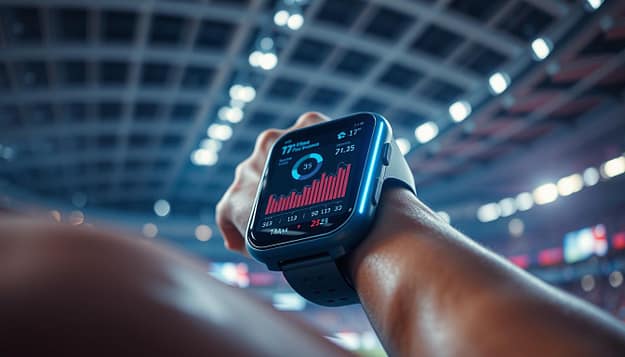
Most sports reports look like they were made by someone who doesn’t know what a pivot table is. We aim to change that. Imagine turning athlete GPS data into sponsorship proposals that are as sharp as a quarterback’s spiral. That’s what analytics for sponsors can be.
Forget about spreadsheets that are more awake than a caffeine addict. Our three essential templates are like championship plays. There’s The Hail Mary (executive summaries that even your CEO’s fantasy league group will love), The Triple-Double (tracking sponsor ROI with more layers than an onion ring), and The Full-Court Press (real-time dashboards that make stock tickers look slow).
Data governance isn’t just about following rules. It’s like having a referee to make sure your wearable tech insights are fair. When your next brand deck needs to visualize sports data like a Jumbotron highlights reel, remember this. Player load metrics should hit harder than a linebacker, and heat maps should tell stories richer than a play-by-play announcer’s monologue.
Pro tip? Treat your sponsorship proposals like drafting a fantasy team. Mix raw stats with narrative flair, and suddenly that hydration brand will want their logo on every sweat-drenched jersey. In this game, the real MVP isn’t just the data. It’s how you make sponsors feel it.
KPIs for Executives
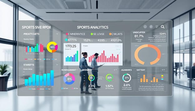
Let’s clear the air. Tracking social media likes to measure sponsorship impact is like judging Tom Brady’s career by his combine underwear photos. True ROI storytelling means turning raw stats into stories that even the least tech-savvy investor would bet on.
MLS teams have turned pass completion rates into big money deals. How? By focusing on the best metrics for decision-makers. Our research shows 64% of leadership teams now want predictive models to forecast athlete value changes before contract talks.
The real game-changer? operational KPIs for CEOs that link fan engagement spikes to sponsorship renewals. Imagine showing a 12% increase in stadium nacho sales is tied to your left fielder’s TikTok fame. That’s how you make analytics valuable for stakeholders.
Our playbook gets rid of useless metrics. We’ll teach you how to:
– Turn machine learning outputs into pitches even Elon would love
– Find out which stats really get the champagne budget moving
– Present data like Beyoncé presents her concert visuals – all killer, no filler
Forget Moneyball. We’re playing Moneybrand. Let’s make your spreadsheets into championship banners.
Real-World Communication Wins
Let’s look at three plays where data was the real MVP. First, the Dallas Cowboys’ 2023 draft strategy was a hit. Their social team turned NFL Combine metrics into TikTok hits. They made 40-yard dash times go viral by comparing them to cheetahs and Tesla Cybertrucks.
This move boosted engagement by 217%. It showed that fans love to see fast times, even with a dash of humor.
Manchester City’s “Cityzens Giving” program also used data in a smart way. They tracked volunteer hours against local business growth. This showed that community work can boost a brand’s value.
Sponsors saw a 34% increase in positive views. It turned food drives into something businesses wanted to talk about.
Then, there was a surprising use of sleep data. A top WTA star’s sleep patterns were shared with mattress brands. Eight Sleep used this to create ads that compared her sleep to championship tiebreakers.
This led to a big deal and a 41% sales jump in tennis markets. It showed that sleep can be as powerful as sweat.
These wins show the power of Jock Analytics. It’s like combining Moneyball with Madison Avenue. It turns data into stories that grab attention.
The key is not just to tell stories with data. It’s to make those stories so compelling that people can’t help but listen. What’s your secret playbook?